Strictly FX UK
Founded in the USA, Strictly FX is a leading special effects company that has recently expanded to open a branch in the UK.
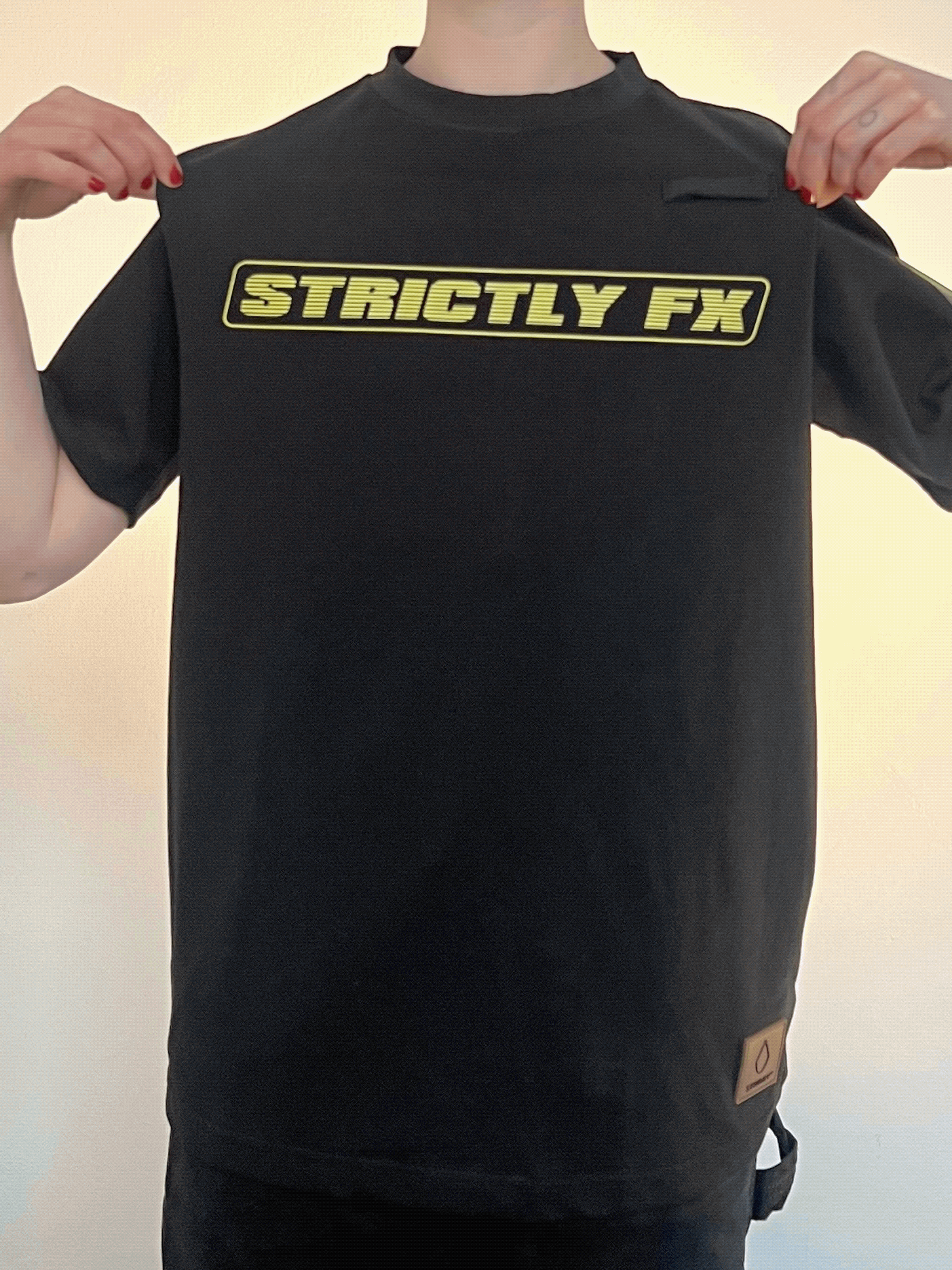
To promote the new branch, I was asked to produce t-shirts to be worn by the crews on European jobs.
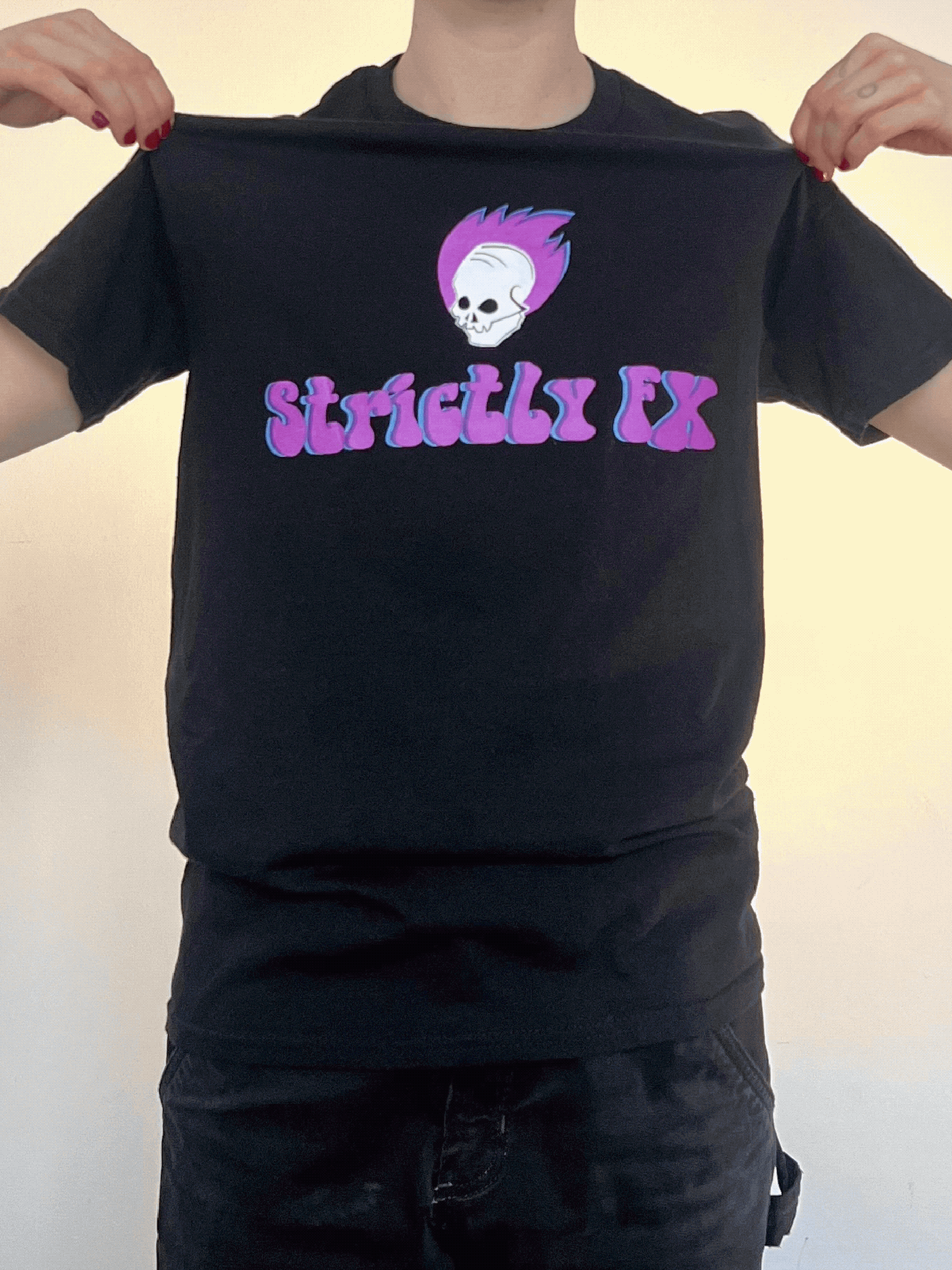
My designs had to be approved by the production team of the client and Strictly FX’s head office. It was essential to accurately represent and celebrate both parties in the same design. Working with Strictly FX’s content requirements, such as the year, the company website and the phrase ‘SFX crew’, I focused on the client through aesthetic choices. The text and logo were informed by Strictly FX and I created colour palettes, fonts and large graphics inspired by the specific event. To give the t-shirts consistency, I incorporated Strictly FX’s iconic motif ‘Skull Boy’ into each design.

Glastonbury Festival
The Glastonbury Festival is the world’s largest, annual greenfield music festival. The first festival took place in Somerset, England, in 1970.
In order to reference the history and tradition of the festival, this design took inspiration from 1970s design aesthetics, incorporating bold, bubbly typography, paisley pattern composition and the saturated colours of disco. I used the acclaimed Pyramid stage in the centre of the design because it is the most widely recognised symbol of the festival, and the primary stage the Strictly FX team would be working on.


A$AP Rocky
A$AP Rocky is an American rapper and musician.
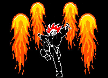
A$AP Rocky had a specific aesthetic, both in his music and fashion, following his album Testing. It incorporated elements of surveillance, industrial safety precautions and themes of risk and experimentation, using digital fonts taken from industrial settings.


I used black, yellow and white from A$AP Rocky’s Testing aesthetic, with splashes of deep red from the Strictly FX branding. I included Strictly FX’s ‘Skull Boy’ by working it into symbols favoured by A$AP Rocky. The choice of the 8-bit drawing came from a conversation with the artist, in which he mentioned a love of 1980s old school video games. I felt the 8-bit design would work with the industrial fonts I intended to use, and showed keen attention to the personal taste of the client.